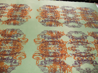
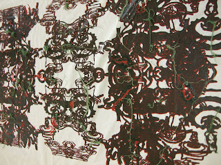
The Design Brief was to design a single pattern which could support a range of London operator's liveries which could subtly promote the individual operator whilst enforcing the London Buses brand with a reassuring unified familiar finish throughout the fleet particularly from a passenger's perspective whilst traveling.
The design should also consider:
● Optional 'Priority' seat and wheelchair area furnishings
● low volume of spare fabric
The design should be:
● commercially viable
● have a pattern that can easily be installed and maintained
● have a constant repeat which is easily matched
● not too overwhelming
● not too small as to create undesirable dazzle
● respond well to daylight and artificial light
● respond well to wear and tear
● accommodate inevitable soiling
● woven into moquette
● incorporate a proportion of uncut looped weave to improve wear and tear
Research
In conducting my research for this project I visited a variety of London Transport locations.
London Transport Museum – to understand the history of transport in London, how the company choses to portray itself and to consider their focuses on the future.
Acton Museum Depot – this depot is ordinarily closed to the public and contains a large archive of moquette designs for both bus and underground trains. The curator of the depot was able to explain further about the moquette process and how the designs have been chosen in the past
Wood Green Depot – this Arriva run bus garage is one of the largest in North London. Arriva were happy to show us a range of buses which was a great opportunity to see the range of bus seating in use and to understand further the relationship between the contractors and TFL. It was interesting to see how proud Arriva are of their buses, although they were not too keen on their current moquette saying it had been chosen to try and impose their branding in the bus but in the cheapest way possible.
Concept Development
I focused on four key themes that I had identified through my research
● Bus routes and maps – the new bus maps were a key part of the TFL's presentation when they introduced the design brief in February. The new design reflects a clear layout and continues the branding TFL by reflecting the curvyness of the Johnston font.
● Illustration – using the new I-cast method I thought about turning distinctive elements from TFL's history and branding to incorporate illustrative designs and narrative within the moquette design such as old fashioned tickets, pictures of buses, images of bus conductors and drivers. I also looked at using stories such as that of the confetti collectors (women who were paid to count the punched stumps from tickets to check the conductor was handing over the correct money) within the design.
● Geometric – there is a strong history of geometric designs within transport seating designs. The underground trains seem to use this particularly, with a focus on square geometric shapes. I looked at using odd block shapes and more rounded softer shapes for bus seating designs including lines to represent movement.
● Circular designs – based on the Roundel logo and the new curvier shape of buses i wanted to reflect the softer curves seen within buses, as opposed to underground designs, within the seating design. I took inspiration from the wheels, lights and Johnston font.
Using grid paper I mapped out five designs using the 12 inch by 12 inch repeat idea. Two designs were based on the circles and line design, one busier than the other. The final three designs reflected three different bus route maps but now shown as a viable repeat pattern. These designs were then re created digtially and sent to be printed.
Final design
I chose to go with the bus route pattern as I felt it worked best as an over all design and would look good repeated across 40 seats on the top of a double decker bus.
I put the pattern into various colourways to show how the pattern could work for each contractor. Each contractor has a shade of red in their branding so I felt that this could be the key colour and the orange and grey shades could change to match the contractors branding bringing a familiar feel to each bus interior.
I have specified the parts of the pattern that should be cut and looped for hard wearing and to give the design texture. Having failed to get much contact with the manufacturers I felt it was important to understand the materials used and so made samples using worsted wool yarns to reflect the yarn count needed to produce the design.
yarns to be used – red flecked with soft grey, orange, dark grey, soft grey worsted wool yarns
● The design encourages passengers to move down the bus, a huge problem in busy periods, and is strong without being overwhelming. ● It reflects the new bus route maps, and differentiates the bus designs from those of the underground trains.
● The cut and loop method would make the fabric harder wearing and by looping the areas of most wear (beneath the head and bottom of the customer) the fabric will last longer.
● The pattern changes colour easily allowing each contractor to place their own branding into the design.
● By using a flecked yarn for the dominant colour of red light will be reflected and stains will not be so visable.
● The design reflects a narrative of journeys and movement which is key to bus travel


